Hi all! I hope you’re doing well. In this post I want to share some tips and tricks to get calligraphy-ing! I have been loving it for years now and doing it whenever I feel like I need a new quote on my wall. But when I started out I got frustrated by the not-getting-it-right-right-away feeling. It took me some practice and helpful tips to get where I am now and my hands are just aching to share it with you!
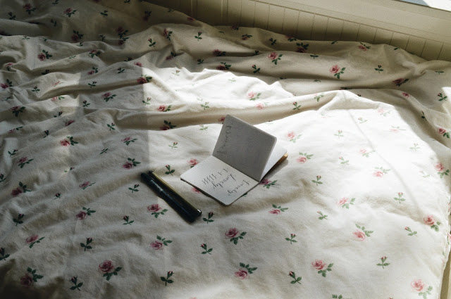
First, let’s start with materials. I like to use the pens above: Pigma brushes and the other one is from Tombow. They are quite affordable and nice to work with. Whatever pen or pencil you use, start with experimenting. Get the hang of the material by making lines or circles, using pressure or less pressure as you go.
Then onto the basic ‘rules’ of calligraphy.
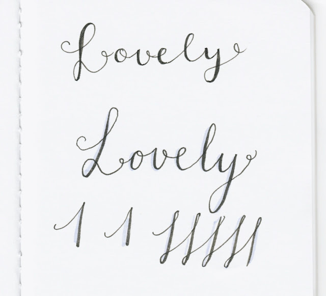
- Upwards strokes are thin and require less pressure.
- Downwards strokes are bigger. Do this by using more pressure on the paper.
If you got the hang of these basic rules you can experiment with different fonts. You can go from serif to sans serif to curly and straight lines.
An old teacher of mine always quoted Picasso: “Good artists borrow, great artists steal”. Just look up handlettering online and copy it. It’s a great way to practice and to do up ideas for types of letters. Once you got the hang of it, you can use these styles to create your own ideas!
Another approach is faking it till you make it, but in a different way than you might think… There is a great technique to make letters look like they are calligraphed, even if you don’t have the right material or skill or patience. With this technique, you just write a word in any handwriting you like with lines the same width. Next, you add an extra line where with calligraphy you would be pressing hard on the paper, creating a thicker line. This line you can then fill in or leave empty for a nice effect. I usually interchange between these calligraphy styles. This ‘fake’ one is handy if you don’t yet really know where you want to put letters or don’t want to focus on the thick and thin lines.
Love,
Eva


No comments :
Post a Comment
thank you for visiting my blog! & it's so sweet of you to leave a message!